Suggestions to change Israel’s emblem that were designed in 2001 by first and second year students in Wizo Design Academy in Haifa guided by Hayim Shtayer and Terry Schreuer; courtesy of Hayim Shtayer.
Designer: Netali Zohar
Copyright: Netali Zohar 2007
The Arab crescent along with the Jewish Star of David hint at the possibility of coexistence on the other hand the whole composition looks like an lunar eclipse which suggests that something is very wrong in the way Israel is living.
Saturday, December 01, 2007
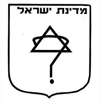
Natali Yaacobi- Question Mark
This is one of many suggestions to change Israel’s emblem that were designed in 2001 by first and second year students in Wizo Design Academy in Haifa guided by Hayim Shtayer and Terry Schreuer; courtesy of Hayim Shtayer.
Designer: Natali Yaacobi
Copyright: Natali Yaacobi 2007
Natali Yaacobi's suggestion is, IMHO, to stop being so damn sure and to start asking if we're going in the right direction.
Designer: Natali Yaacobi
Copyright: Natali Yaacobi 2007
Natali Yaacobi's suggestion is, IMHO, to stop being so damn sure and to start asking if we're going in the right direction.
Click to see more:
Hayim Shtayer,
Israel
Maria Yofarb - upside Down
Suggestions to change Israel’s emblem that were designed in 2001 by first and second year students in Wizo Design Academy in Haifa guided by Hayim Shtayer and Terry Schreuer; courtesy of Hayim Shtayer.
Designer: Maria Yofarb
Copyright: Maria Yofarb 2007
The Star of David stands right even if you turn it upside down, but the Hebrew letters of the word Israel look like in a mirror and are written from left to right. This may mean two things:
a. that we live in a state that behaves wrong.
b. that we are influenced from western cultures.
Click to see more:
Hayim Shtayer
Subscribe to:
Posts (Atom)